Crodino
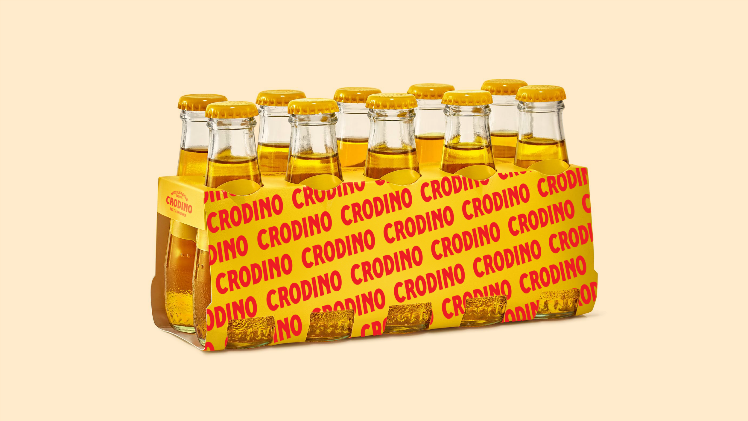
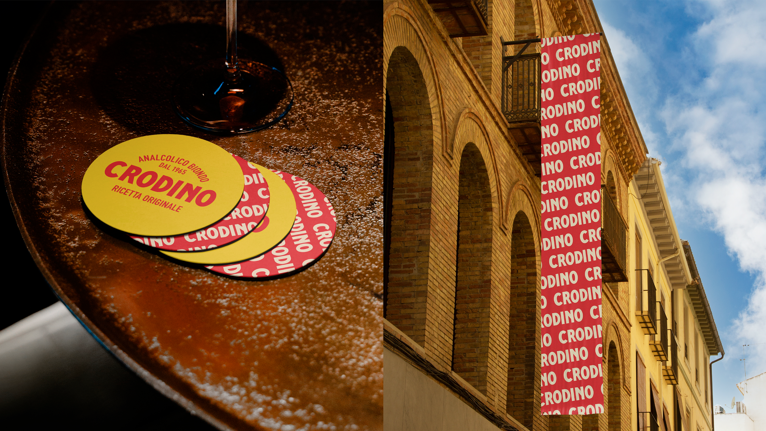
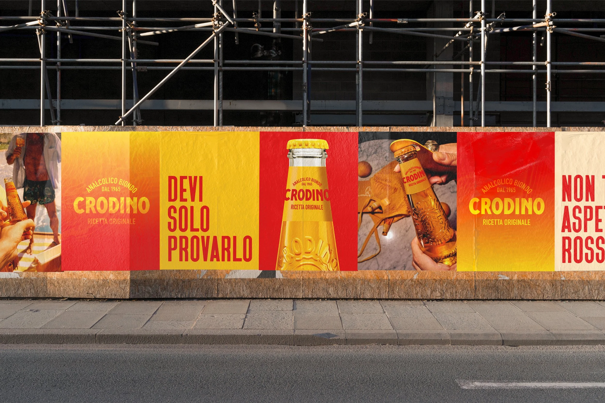
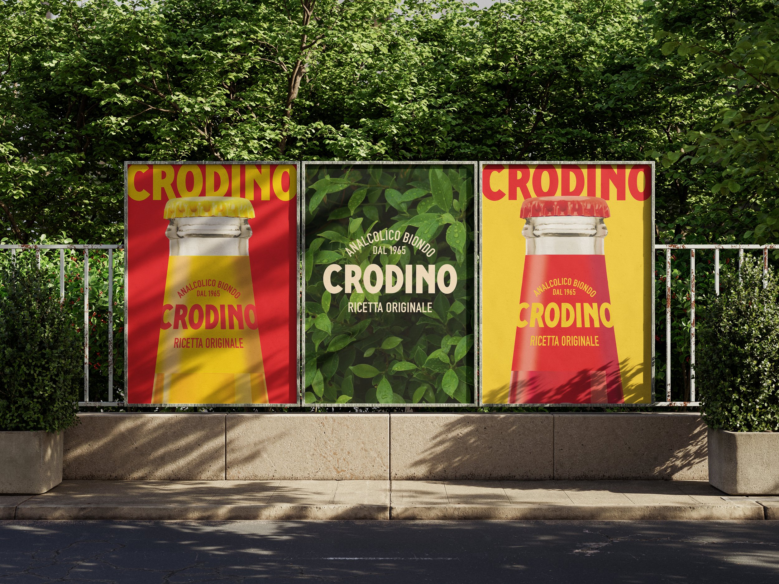
Crodino is an institution in Italian aperitivo culture, but its legacy visual identity was beginning to feel dated to younger consumers. As part of T&P Italy’s pitch to evolve the brand, we created a comprehensive visual overhaul designed to bridge classic heritage with contemporary relevance.
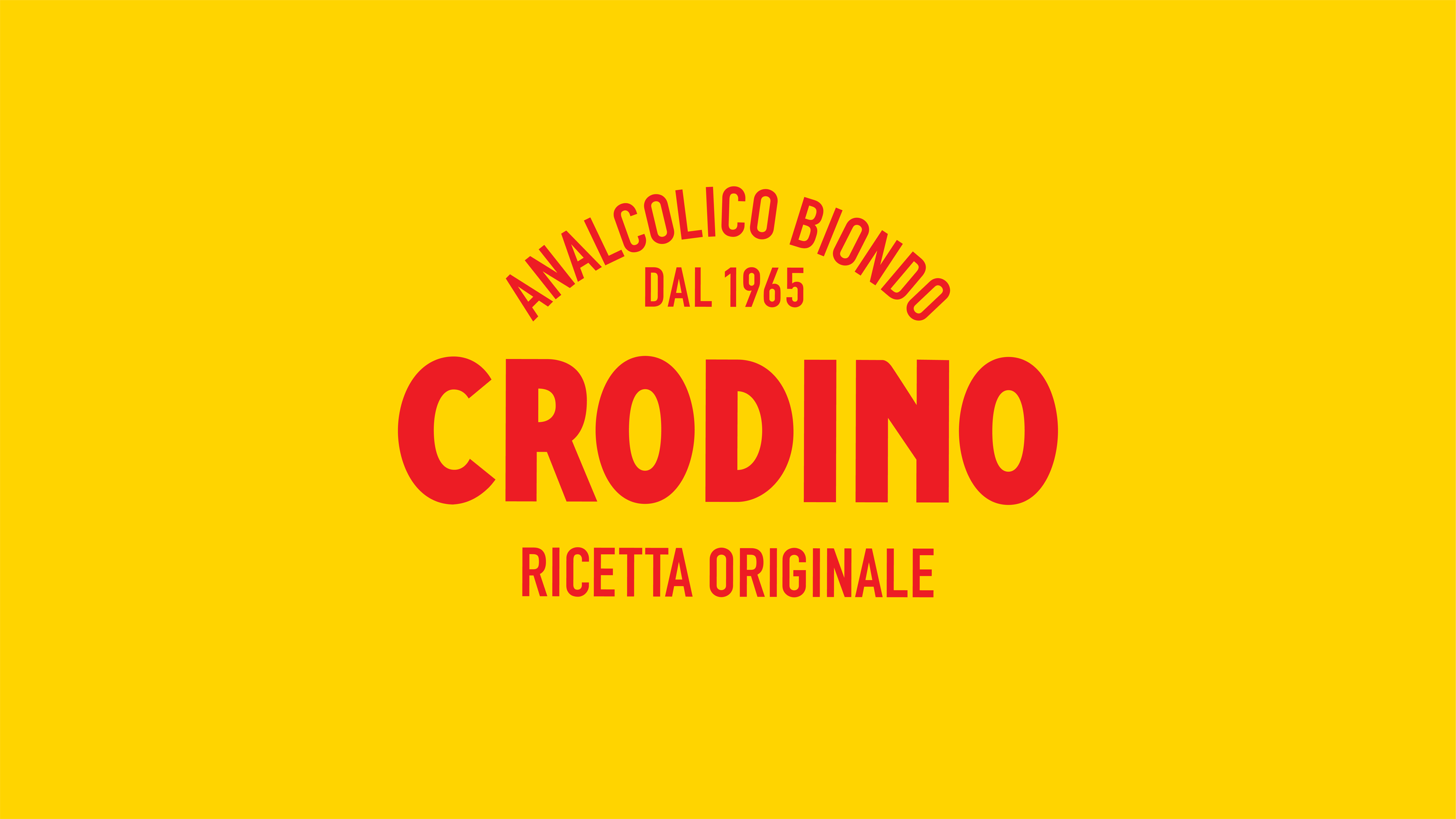
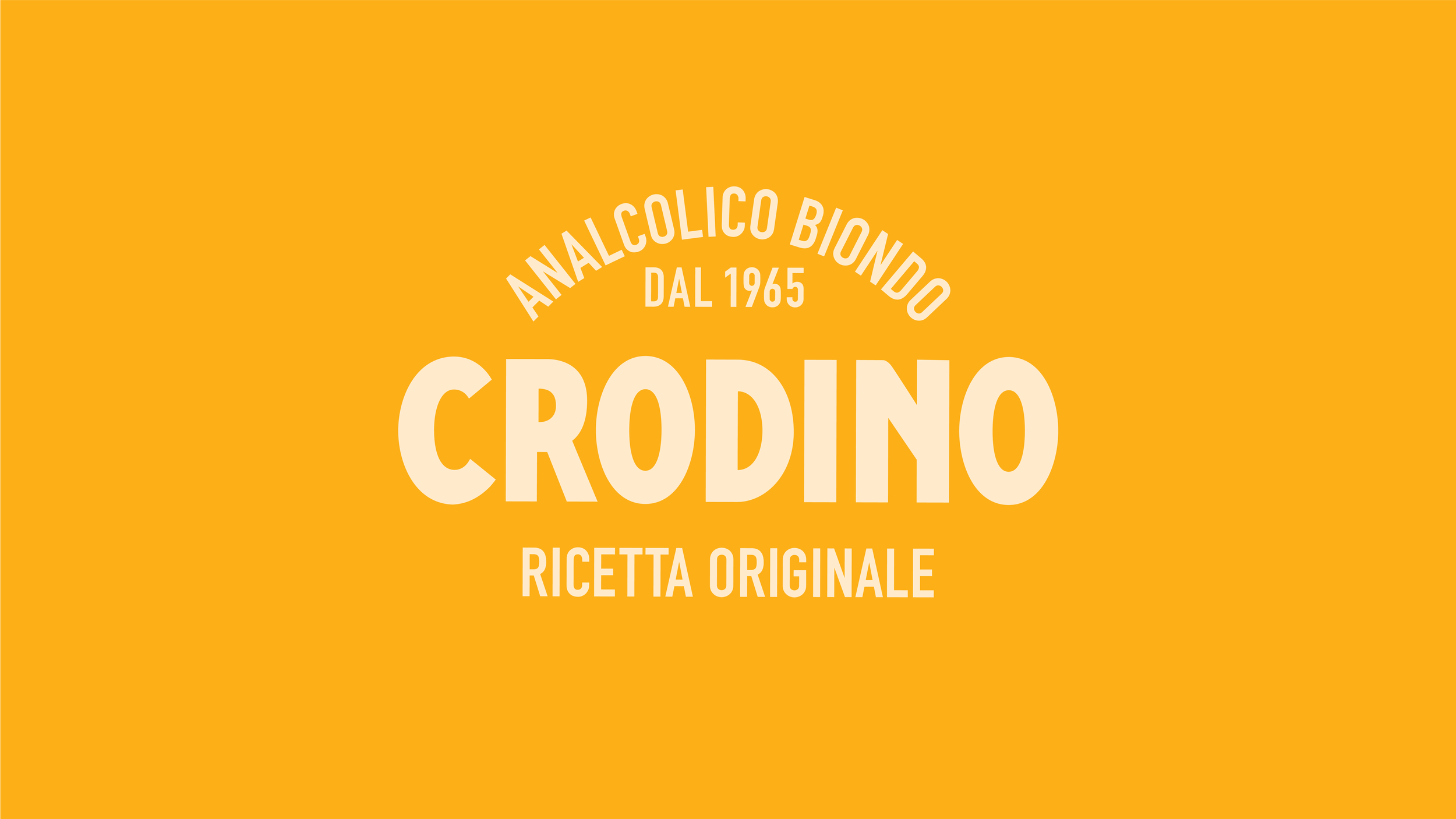
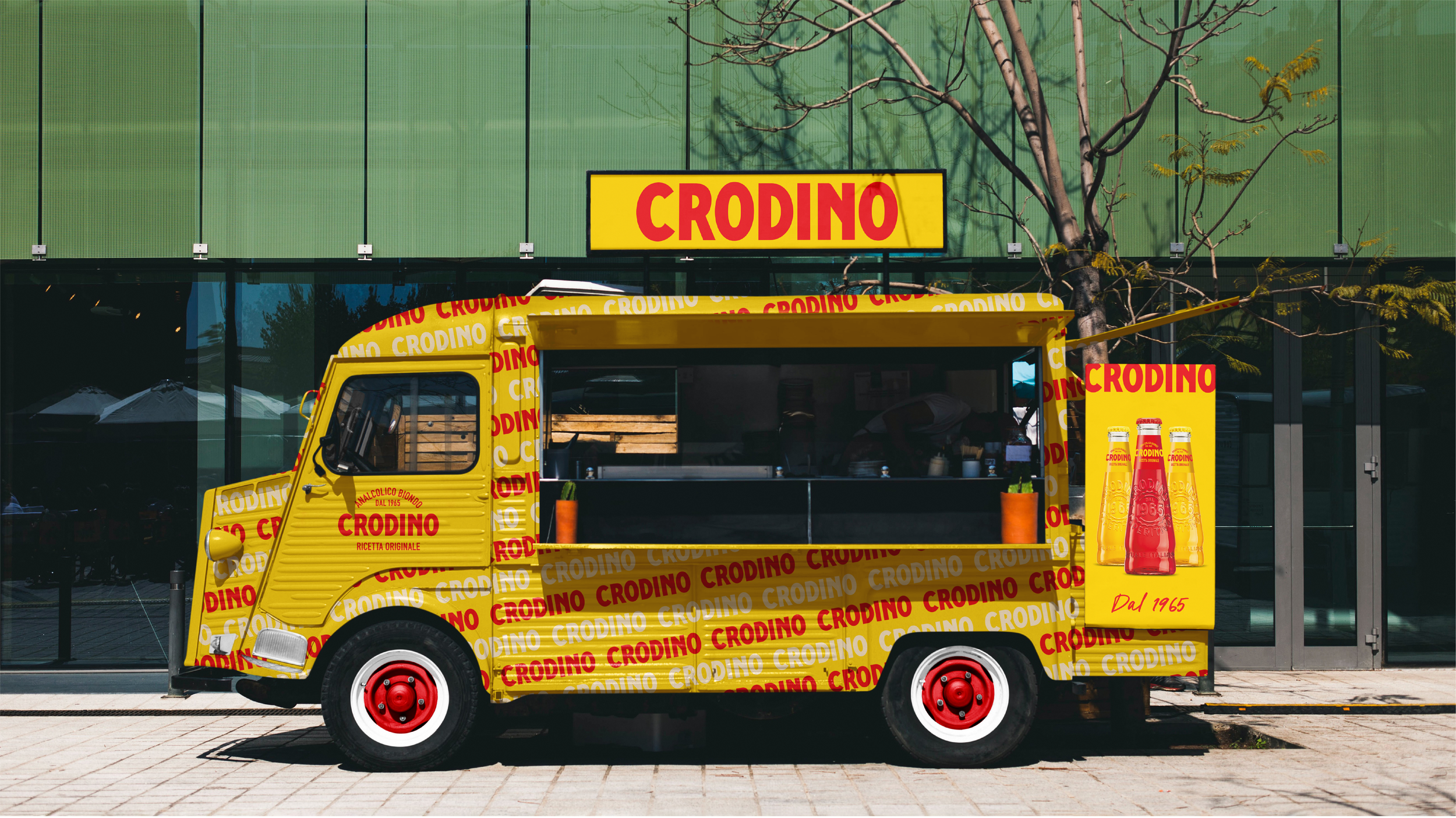
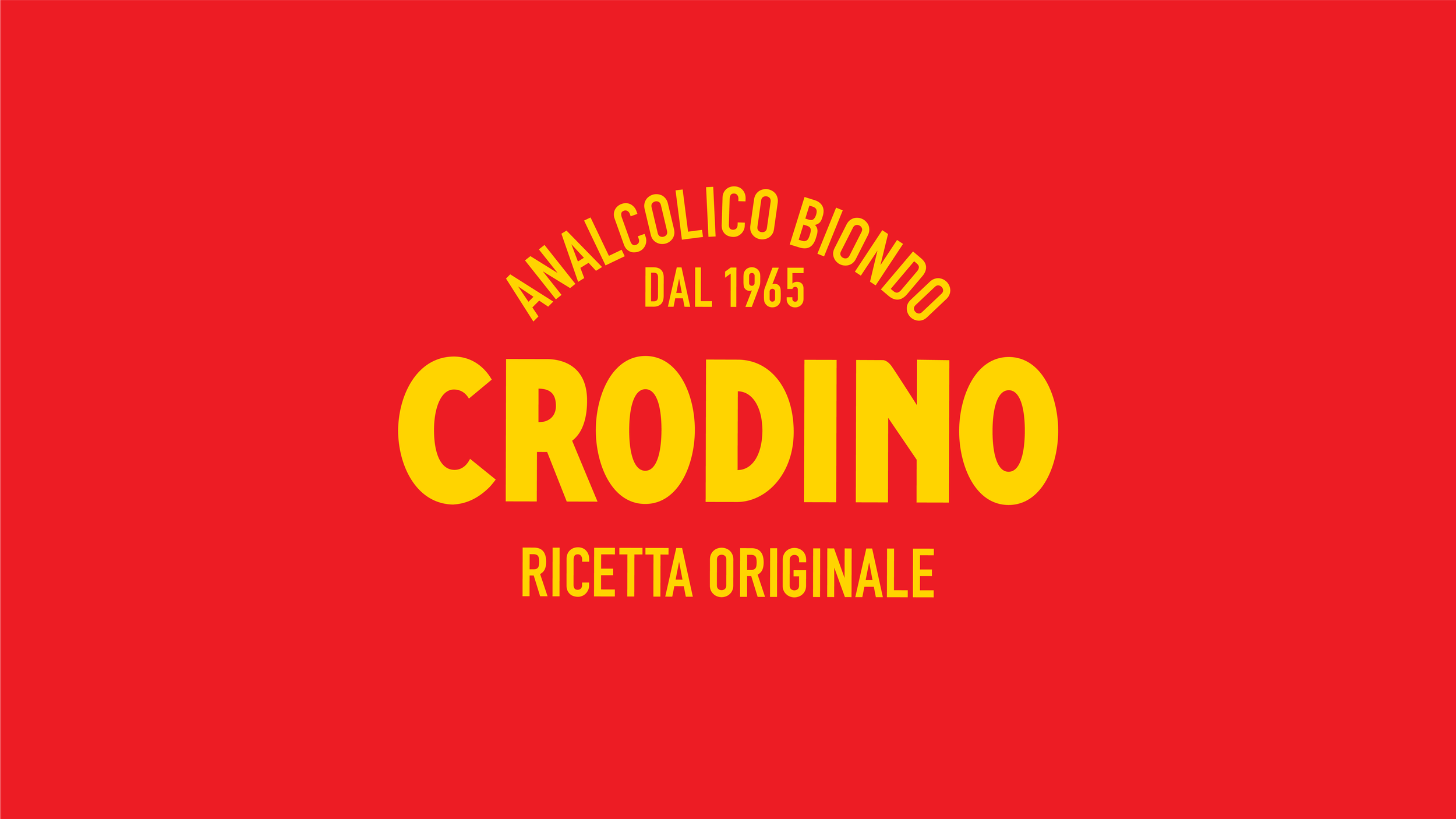
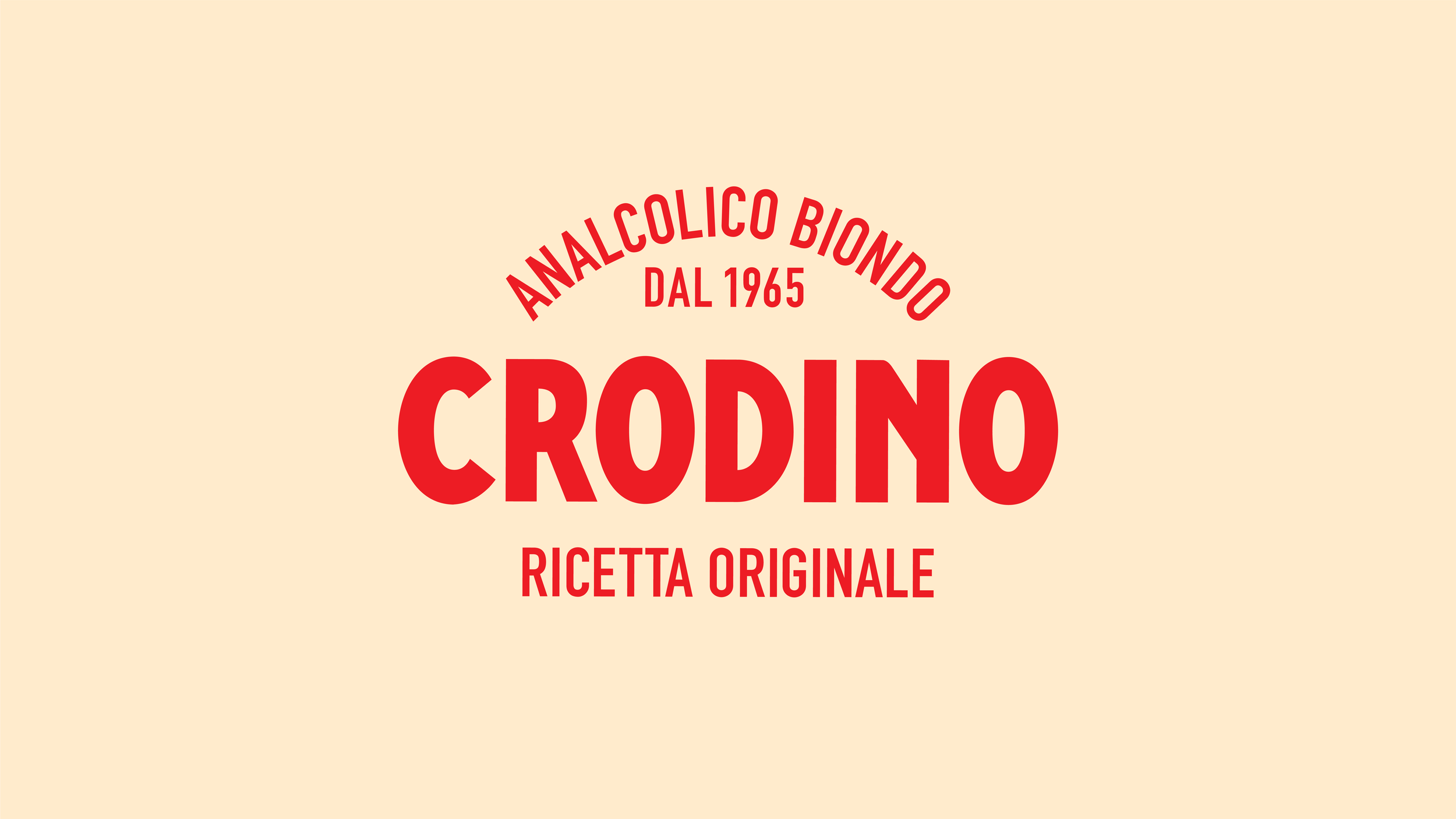
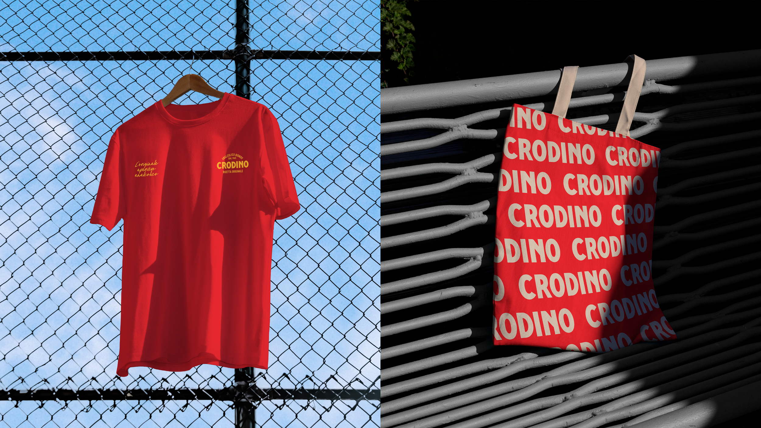
The proposed design system introduced a refined logo update, a modernised colour application, and a bold suite of versatile graphic assets engineered to stand out across digital, retail, and campaign channels. By honouring Crodino’s iconic roots while infusing the brand with fresh energy, the concept demonstrated how a classic Italian staple could meaningfully connect with next-generation drinkers.
The Challenge: Modernise Crodino’s classic visual presence to engage a younger audience without diluting the brand’s deeply rooted heritage and signature identity.
The Concept: Developed a pitch presentation for T&P Italy, crafting an evolved design framework that balances tradition with modern design principles.
The Execution: Proposed a precise logo refresh, updated the iconic colour system, and created a scalable suite of new graphic assets designed for modern social, packaging, and campaign touch points.
Agency: T&P
Role: Design Director
Head of Art: Dan Beckett
DESIGN DIRECTOR: WILL REES
Motion Designer: Julien Lasson